

Best Indicators for Swing Trading
Replace $2000/Month of Trading Tools with these Indicators | Edition 62

Today I’m going to show you the best indicators for Swing Trading.
The best part?
They are all free.
And if you stick with me to the end, I’ll hand you my exact TradingView layout with all 6 indicators already configured, so you can copy my entire chart setup with the press of a single button.
This is the same layout I use every single day as a full-time swing trader to screen hundreds of stocks, qualify setups in seconds, and manage every position from entry to exit.
The 6 best indicators for Swing Trading
Here is an overview chart with all the indicators
Now let's take them one by one.
1. The indicator for better stock selection
Swing Data, developed by Jeff Sun, is a consolidated table that displays directly on your chart all the metrics you need to understand the “personality” of a stock, meaning how it moves, how volatile it is, and how liquid it is.
What the indicator does
It transforms the chart into a mini stock-selection dashboard, bringing together in one table all the liquidity, volatility, and relative strength metrics you need to qualify or disqualify a candidate in seconds, without opening other tools.
What it concretely displays
Market Cap, the total market value of the company.
Float %, percentage of shares available for trading, directly influences volatility.
ADR%, the average daily movement in percentage, a key volatility indicator.
ATR, the average price volatility including gaps.
LoD dist., the distance from the Low of Day relative to ATR, expressed as a percentage.
Average Daily $ Volume, the average daily value traded in dollars.
Average Daily Volume, the average number of shares traded.
Projected Volume, the estimate of total volume for the current day.
Relative Volume, current volume compared to the average.
Liquidity Cap, based on 1% of average volume.
IBD RS Rating with one decimal.
Up/Down Volume Ratio.
% distance from 52W High and 52W Low.
SPDR Sector RS Rating next to the sector name, for quick reference (e.g. XLK RS-65 vs AVGO RS-97).
Intraday % Change on SPDR Sector, to compare the strength of the stock vs. the sector it belongs to in real time.
How it helps me with stock selection
I use this tool as a stock selection filter. It is very powerful and helps me filter dozens of daily stocks much faster than I used to.
Market Cap, I want to see at least 1B; anything below that is considered a penny stock for me, a deliberate rule to prioritize stability, liquidity, and technical reliability.
Avg $ Vol, I want to see at least $100M traded every day (although even this is a bit illiquid), because I want as many institutions as possible to be involved in that stock. Institutions need liquidity to move their positions; they don’t enter and exit instantly like we do with a 10k-1 mil account.
The simple rule is Avg $Volume per day must not be less than 100 times your capital. Example: you have a $1 million account, don’t trade anything smaller than $100 million average $ volume per day. The bigger, the better.
ADR%, I’m interested in it being as large as possible. I explained here in detail why. I strongly recommend you read this.
RS Rating is a very important component, I don’t want to buy anything that doesn’t show relative strength compared to the index and to the sector it belongs.
LoD distance, if it is over 60%, most of the time I no longer buy that stock. Why? Very simple. Because the move has already happened and there is very little space left for me to have an acceptable profit at the end of the day to hold the position overnight. You want to have confidence that you can hold that position and not wake up to a huge overnight gap.
Why it’s useful for you as a swing trader
You qualify or reject a candidate in seconds based on hard thresholds (Mcap, Avg $Vol, ADR%, RS), instead of opening 4-5 tools for every ticker.
You filter out late entries automatically with LoD distance, avoiding chasing moves that are already extended intraday.
You confirm relative strength vs. index and vs. sector before entering, a core requirement for momentum swing setups.
You can download this indicator for free here: https://www.tradingview.com/script/uloAa2EI-Swing-Data-ADR-RVol-PVol-Float-Avg-Vol/
2. Moving Average Indicator
I use SMA 20, 50, and 200 because they cover three different time horizons, and together they give you clear context of trend, momentum, and probable zones of support/resistance watched by everyone, including institutionals.
In swing trading, it matters enormously to enter in the direction of the dominant trend and as close as possible to relevant averages, so you have an edge on probability and risk/reward ratio.
SMA 20
It is the short-term average, reacts quickly to price, and shows you recent momentum. Many swing traders use it as a guide for position management and for pullback entries, watching price bounces off 20 as a signal of trend continuation.
SMA 50
It is the medium-term average, filters out noise, and shows you how healthy the trend is in the last few weeks.
SMA 200
It is the classic long-term trend benchmark, intensely used by institutionals as well. The fact that the price is above or below 200 is seen by many as a delimitation between bullish market and bearish market, and reactions at 200 often mark key points or important consolidation zones.
I avoid buying anything that is below the 200 Simple moving average.
And that green line you see on the chart above is the 9 EMA. I use this indicator to quickly get me out of short-term positions.
You can download this indicator for free here:
https://www.tradingview.com/script/V8E1T8Sq-Multiple-Moving-Averages/
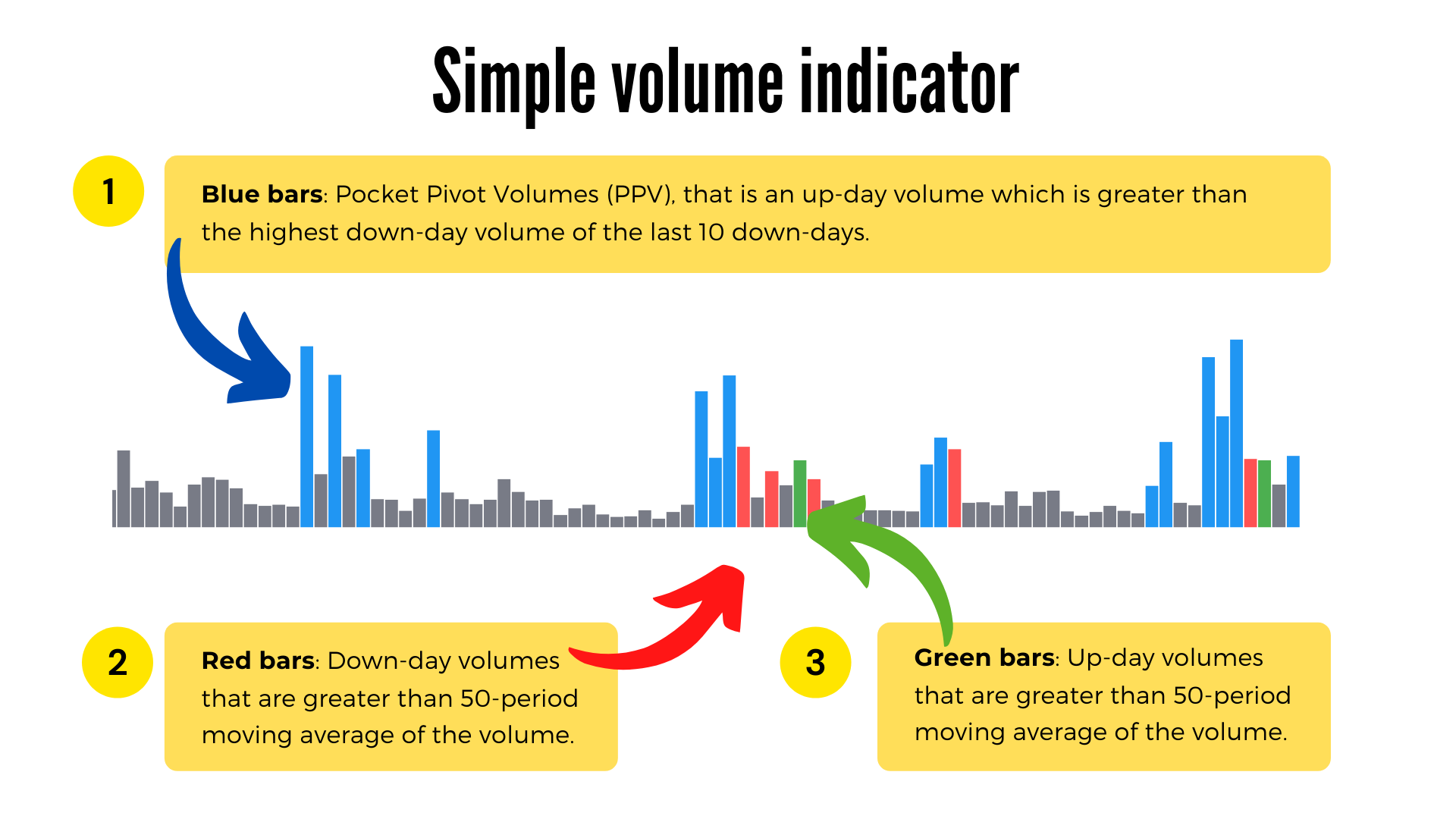
3. Simple Volume Indicator
Here is a diagram so you can understand the difference between the conventional volume indicator and this indicator.
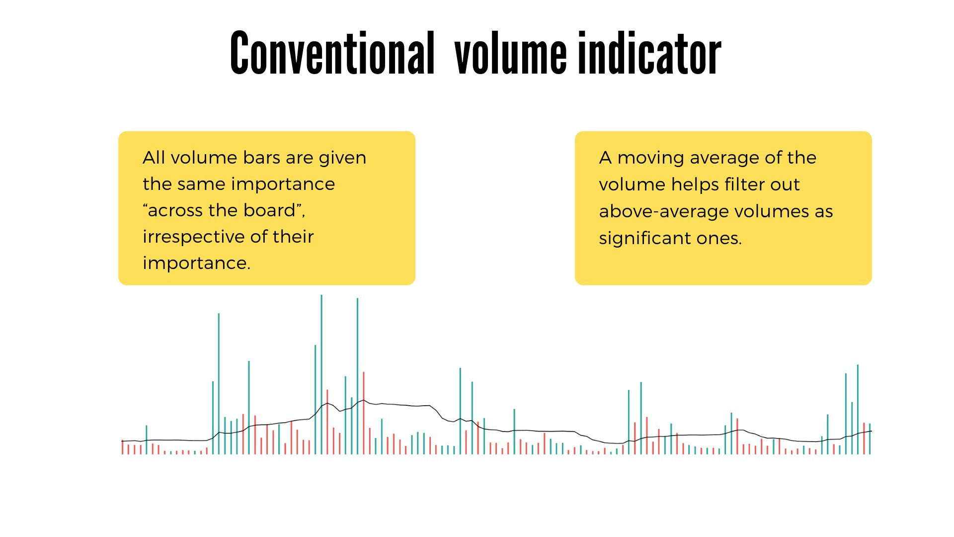
I use it because it removes the noise from volume and leaves me only the signals that matter for momentum and institutional accumulation.
It fits exactly with my routine of screening and searching for entries on stocks.
What it shows me clearly
Blue bars (PPV): pocket pivot type volumes, a sign that institutionals are buying in the base or on the breakout.
Green bars: up-day above the 50 average, confirms real demand on the move.
Red bars: down-day above the 50 average, shows me unconsumed supply that needs to be absorbed.
Dark gray bars: volume below average, noise, I ignore them.
Orange bars: “dry” volumes, typical in tight consolidations before a breakout.
How it helps me with entries
I see if the recent reds (RRV) are followed by bigger greens or if their highs are taken, a sign that the supply has been absorbed.
Multiple PPVs in the base plus PPV on the breakout candle = strong bullish signal of accumulation.
Bull Snort (volume 3x average, close in top 35%) marks for me the impulse candles that I watch as a long trigger.
Quick context on the table
RVol, Volume Buzz, U/D ratio and Avg$Vol tell me at a glance if the stock has enough liquidity for my size and if the current day is statistically significant.
1mL (1-minute liquidity) confirms that I can enter and exit without large slippage, important for progressive exposure.
Projected RVol gives me, even during the session, an estimate of the final volume, useful for intraday execution on swing setups.
HV edges for “big winner” stocks
The HVE, HVY, HVQ labels mark the highest volumes ever, over one year, over one quarter, typically zones of aggressive institutional accumulation.
These help me filter the candidates with the highest probability of becoming big winners, exactly the type of momentum stocks I bet on.
You can download this indicator for free here:
https://www.tradingview.com/script/JkB0iCFp-Simple-Volume-with-Pocket-Pivots/
4. ATR% multiple from 50-MA
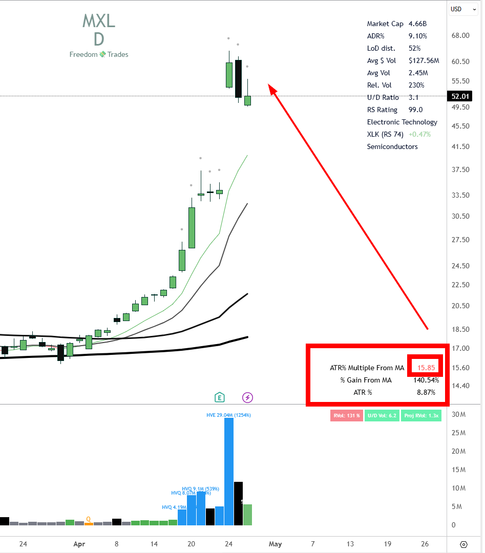
The indicator quantifies how “extended” the price is compared to the 50 moving average, expressed in multiples of ATR%, not in absolute percentages.
This way, a volatile stock and a slow one can be compared correctly, because the inherent volatility of each stock is normalized through ATR.
The formula explained
A = ATR% = ATR / current price, so how much the stock moves daily, as a percentage of price.
B = % gain compared to SMA 50, so how high the price is above the 50 average.
B / A = how many times ATR% fits into the distance to the SMA 50.
Example: if ATR% = 3% and the price is 24% above SMA 50, you are at 8 ATRs of extension, so in a profit-taking zone.
What it concretely helps you with
It gives you an objective threshold for scale out, typically 7-10x ATR% above SMA 50, where statistically stalls and pullbacks appear.
It eliminates the emotional decision; you sell in pieces when the math says the position is stretched, not when “it seems like a lot to you”.
It can also be used in reverse, for shorting on overextension.
Why multiples of ATR, not percentages
20% above SMA 50 on a stock with ATR% 2 means 10x ATR, very extended.
The same 20% on a stock with ATR% 5 means only 4x ATR, still healthy.
The raw percentage says nothing without volatility context; the ATR multiple does.
You can download this indicator for free here:
https://www.tradingview.com/script/oimVgV7e-ATR-multiple-from-50-MA/
5. EPS & Sales
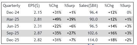
What the indicator does
If I have to choose between 10,000 stocks that I can buy in the US market, naturally I want to buy the best one.
And how do I see that? Well, by looking at EPS and Sales, the most important engines for the growth of a company.
If suddenly a company has a triple-digit sales growth surprise or EPS, analysts will be forced to reprice that company.
And institutions will buy the company as it is now more attractive at that price.
This script brings to TradingView the MarketSmith / MarketSurge type table with EPS and Sales growth quarter vs. the same quarter from the previous year (YoY), plus QoQ and estimates for the next earnings.
Practically, it transforms the chart into a mini fundamental terminal, without opening another tool.
What it concretely displays
Table with the last quarters of EPS and % YoY variation compared to the equivalent Q from last year.
Sales YoY growth on the same quarters, aligned with EPS.
QoQ for EPS and Sales, as a filter of sequential acceleration/deceleration.
Arrows on the chart exactly on earnings day with the % of growth, MarketSmith style.
Optional columns: Surprise (actual vs. estimate), ROE, Gross Margin.
Estimate for the next earnings, so you know the date and the market’s expectations.
Why it’s useful for you as a swing trader
You quickly confirm on the chart your criterion of double-digit EPS and Sales growth, one of the base metrics in your scanner.
You validate “C” and “A” from CANSLIM, current and annual EPS, without leaving TradingView.
You see the acceleration pattern: successive quarters growing EPS from 25% to 45% to 80% is a classic signal of a leading stock.
Surprise % tells you if the company constantly beats estimates, a frequent catalyst for breakouts with volume.
The date of the next earnings helps you avoid entering long 2-3 days before the report, or plan partial exits beforehand.
You can download this indicator for free here:
https://www.tradingview.com/script/WiaFmLGR/
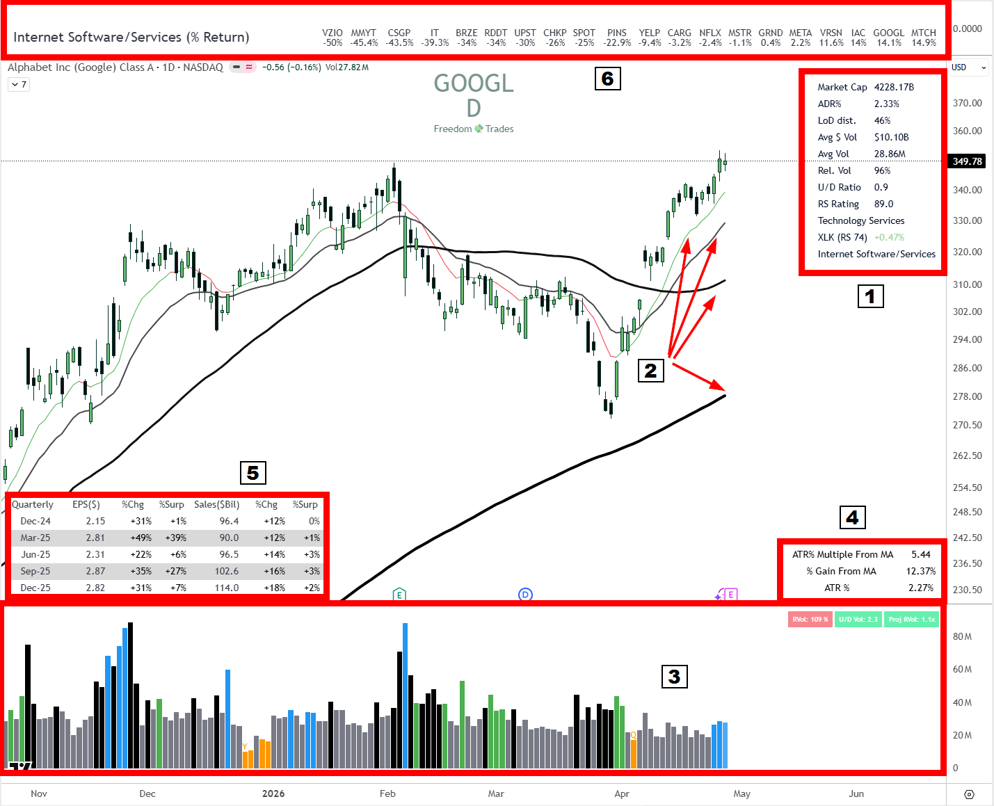
6. Industry Group Strength Indicator

Here is the translation, keeping the original format:
Industry Group Strength shows you, directly on the chart, the strongest stocks from the same industry as the ticker you are looking at, ordered by performance.
Practically, it transforms the chart into a mini peer-group comparison, so you can see if your stock is a leader or laggard in its own industry.
How it works
It has predefined lists of stocks by industry, filtered on market cap above 2B, price above 10 dollars, and primary listing.
It automatically detects the industry of the current ticker and loads the peers.
It sorts them by the chosen metric and displays them as a table with color-coded lines on percentiles.
Available metrics
YTD Return, performance from the beginning of the year, useful for seeing the leaders throughout the year.
RS Rating, 1 to 99, relative to S&P 500 on a lookback chosen by you.
% Return on a custom lookback, e.g. 1M, 3M, 6M.
Why it’s useful for you as a swing trader
You confirm your rule from the daily routine of following the sectors and industries where institutional money flows in.
You only buy group leaders, not laggards, the oldest CANSLIM rule, “L” from “Leader or Laggard”.
You avoid the trap of buying a stock that looks good alone on the chart, but is the last in the industry, a sign that the industry’s momentum has moved on to others.
You can download this indicator for free here:
https://www.tradingview.com/script/5NsvcOVp-Industry-Group-Strength/
Bonus for PRO members
I’m going to give you my layout and all the settings of these indicators, so you can copy exactly what I use.
And all this very simply through the press of a single button.
Here is the link
